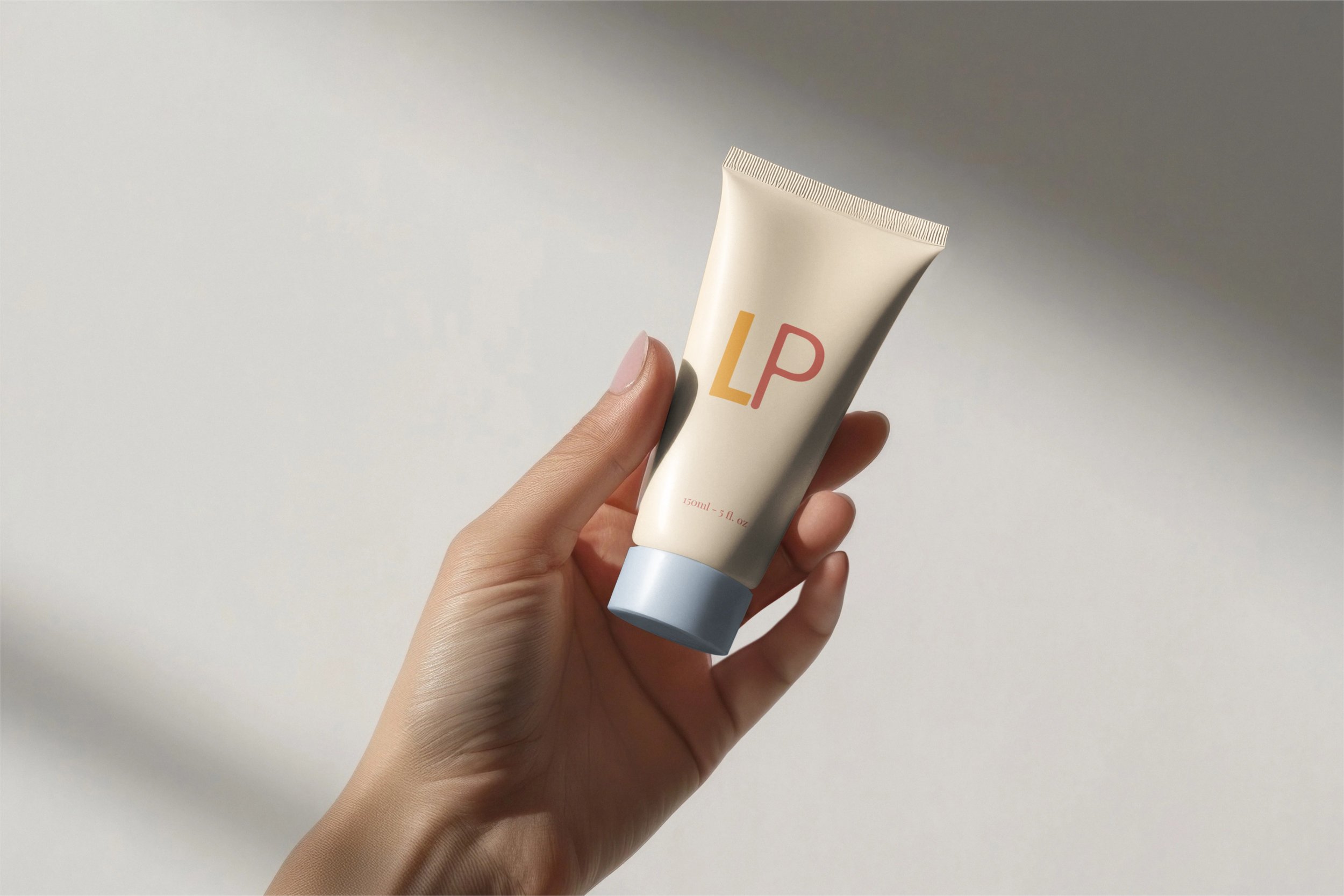
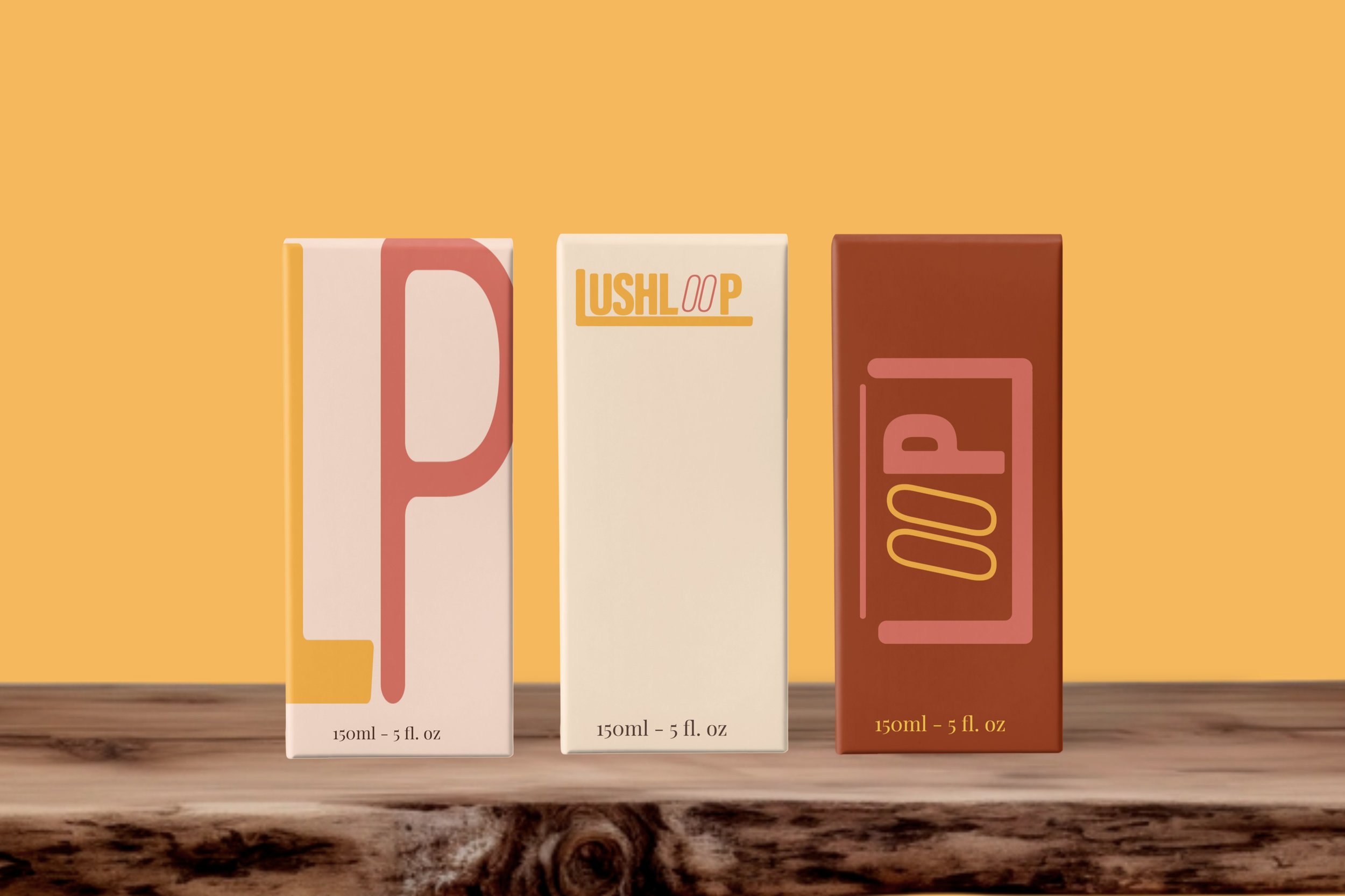
Created a refined, vibrant brand identity for a sustainable soap line—including logo, cohesive visuals, and curated extensions to boost recognition, convey eco-conscious values, and support premium positioning.

Tone:
Young, creative
Colors:
Vibrant, fresh, light
Target audience:
20-35 yo
Objective:
Brand Identity
Keywords:
Healthy, natural
Logo Design
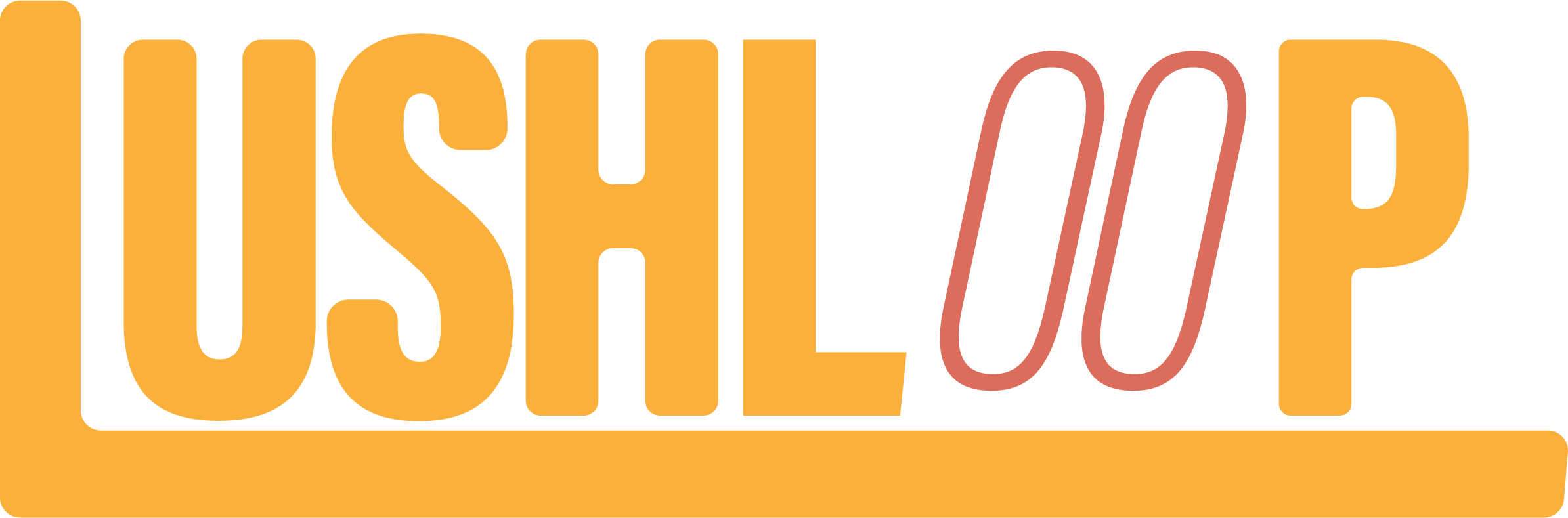
I decided to make one primary and two secondary logos that were meant to still be recognizable, by emphasizing the “OO” in the first secondary design, as well as using the two main colors.